Updated Apr 24, 2025
Consumer Product Design
2024 – 2025
Figma to Table: Designing Tableside
A reflection on building the a beautiful dine-in experience. Designed to showcase the menu and elevate the moment, and speed up service.

Challenge
Today’s dine-in
experience is outdated

Opportunity I
Paper menus lack
photos and context
Despite promises of speed and images, they're often confusing and leave everyone glued to their phones—disconnecting us from the meal and the moment.
Opportunity II
QR codes add
friction to ordering
Despite promises of speed and images, they're often confusing and leave everyone glued to their phones—disconnecting us from the meal and the moment.


Opportunity III
Inconsistent service
falls short of expectations
Despite promises of speed and images, they're often confusing and leave everyone glued to their phones—disconnecting us from the meal and the moment.
Solution
Snackpass Tableside
A beautiful, immersive, and customer-friendly tableside ordering experience—one that celebrates the cuisine, brings the restaurant’s story to life, and delivers the hospitality of the best server on their best day, every time.
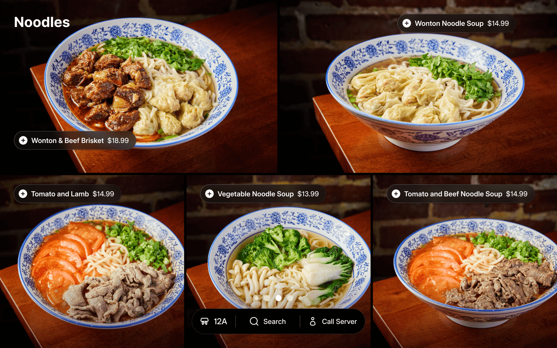
Designed for guests to hold and flip through. With Highlights, menu items come to life through video and photography—no need to pull out a phone to search. Tableside lets restaurants guide customers and elevate the dining experience without training additional servers.

Feast your eyes. A stunning tablet experience built for effortless ordering.
Process – Team
In-store insights
Working alongside a PM, engineers, and a researcher, we moved fast—designing, developing, and deploying quickly to gather real-world learnings from restaurants and their guests.
I built Figma prototypes to test new layouts, while partners shared their thoughts, sometimes even sketching rough ideas. We also studied digital dine-in menus from Asian markets, where the concept less novel.
As the only designer, I had to cut through the noise and advocate for decisions that often came down to instinct and taste.


A host of options. In place of a server, a short guide helps guests get going.

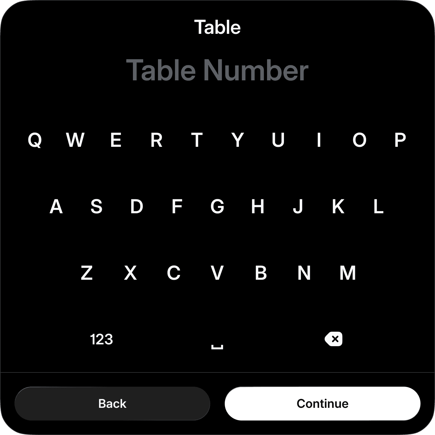
A new type of fast. I created a custom keyboard to help guests add table numbers more easily.
Detail – Custom Keyboard
Key moments
First impressions are everything in a restaurant. To keep onboarding focused and fluid, I made custom inputs to replace the clunky Android keyboard—so guests get to the main course even faster.

Process – Ideation
Principles over preferences
Working with our partners, I generated concepts and prototyped for fast feedback—but trying to please everyone cluttered the product.
Stepping back, I defined two principles:
1. Hero the content
2. Make it instantly understandable
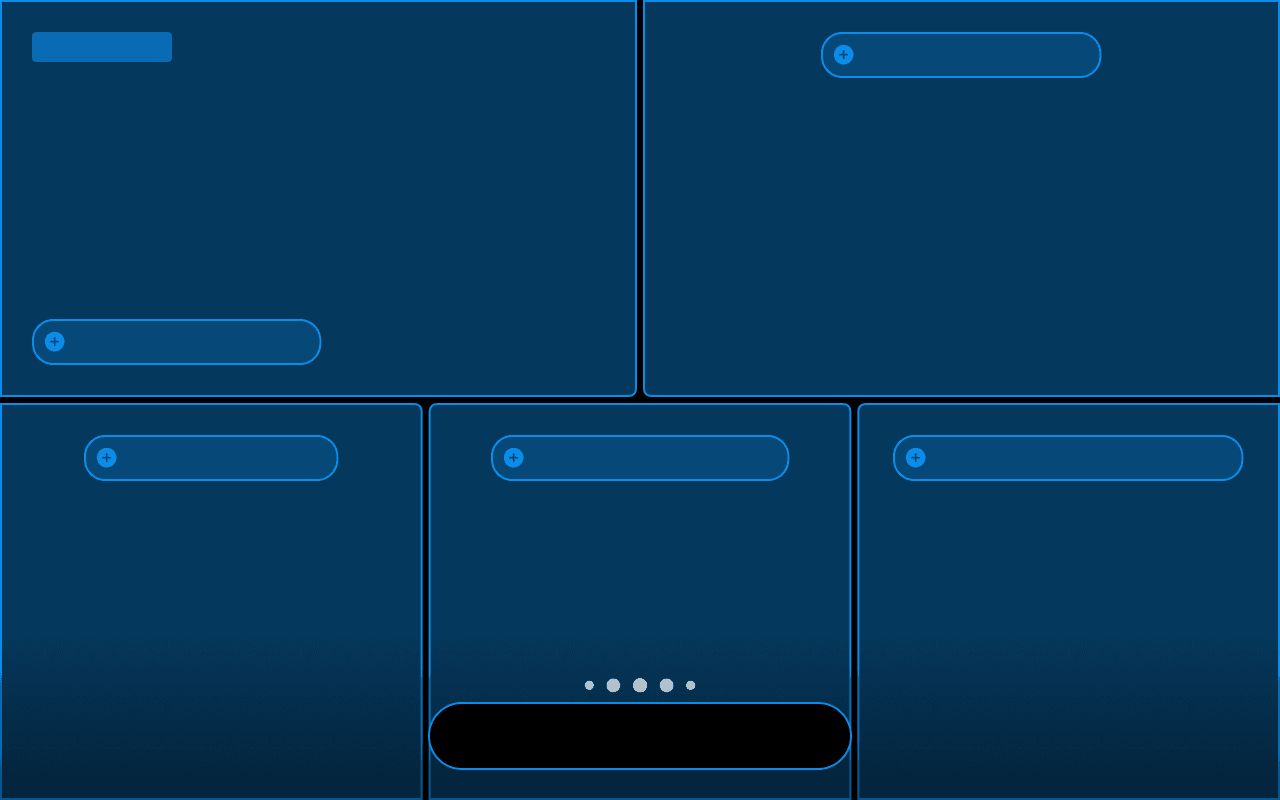
Grid exploration based on early partner requests.
Process – Iteration
Return to simplicity
Designing the perfect experience wasn’t a straight path. We worked iteratively with our restaurant design partners—refining the look and feel through constant feedback.
During testing, I realized the flexible grid made the images too small and the screen feel complex. Limiting layouts to full and half-screen, keeps content immersive and navigation intuitive.


Side by side. I developed a flexible canvas for delicious visuals and immersive storytelling.

Put clarity on the menu. Buy removing abstraction, guests browse naturally and tap directly.

On the grid. For larger menus, I added a fast, familiar way to browse.

Made to order. Designed for seamless, accurate item customization.
Detail – Design System
From pixel to platform
I created Tidbit—a flexible design system of icons, colors, and components—built to deliver consistent, beautiful Tableside experiences for any restaurant.


Double check. Checkout. Guests add and review items, track progress, and order at their own pace.
Detail – Action Bar
Designed to adapt
Action Bar displays session info like table number and timers, along with core actions like add to cart or checkout—seamlessly responding to context.

Surprisingly easy. No surprises. Breakdown helps guests see they're only paying for what they ordered.

Go halfsies. Parties often split the check, so I made it easier to divvy it up at checkout.

Reflections – Big win
Prototypes are powerful
Getting the idea into the hands of a customer early made it easier to validate, learn, and refine quickly.
Reflections – Lesson learned
Where feedback fails
Customer insights are invaluable, but it’s my responsibility to shape the vision, craft the experience, and set the bar.


Reflections – Tradeoff
Custom vs. consistent
I limited branding to logos and colors—enough for identity without compromising cohesion. More flexibility would have enabled bespoke experiences, but could add edge cases.
Outcome and impact
Guests love flipping through the visual menu with friends, discovering favorites, and ordering on their own terms.
And Tableside is driving sales growth with new dine-in restaurants. Restaurants are excited to showcase their menus in a more visual, engaging way while streamlining service, reducing pressure on staff, and keeping guests happy.